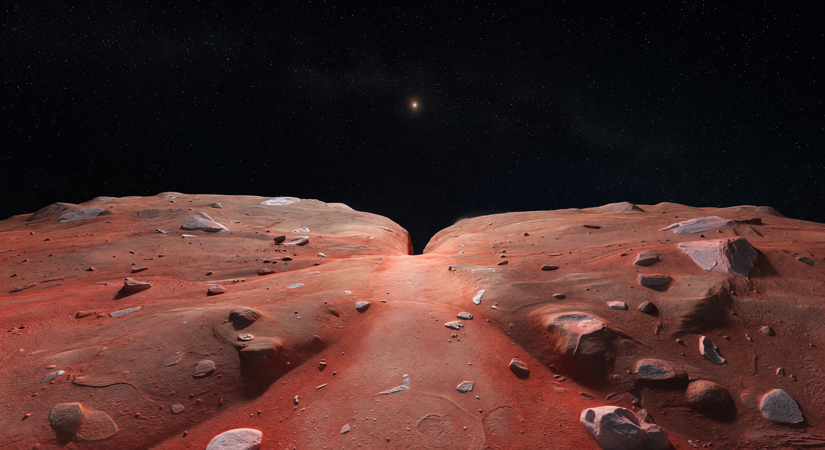
Desde una suave elevación sobre el estrecho cuello, se extiende una franja más clara de tonos naranja rojizo pálido que une dos paisajes abombados y aplanados, mientras el terreno se curva en sentidos opuestos y delata, a escala humana, la extraña geometría de un cuerpo binario de contacto. La zona del istmo se ve más lisa y luminosa, tapizada por un regolito helado de grano fino mezclado con compuestos orgánicos complejos enriquecidos en tolínas ultrarrojas; hacia ambos lóbulos, el color se intensifica en carmesíes y burdeos más oscuros, salpicados por pequeños escarpes, fosas someras, bloques angulosos, cantos semienterrados y discretas fracturas poligonales, con ocasionales destellos gris blanquecinos de hielo más fresco. Todo parece inmóvil desde hace miles de millones de años, preservado en un vacío sin aire ni actividad, bajo una gravedad débil y una iluminación tenue en la que el Sol no es más que un punto brillante parecido a una estrella. Sobre ese horizonte doble y silencioso, el cielo es un negro absoluto sembrado de estrellas nítidas y de la franja lejana de la Vía Láctea, haciendo que este pequeño relicto helado del sistema solar primitivo se sienta a la vez íntimo, remoto y profundamente ajeno.
Comité de revisión científica
Cada imagen es revisada por un comité de IA para verificar su precisión científica.
GPT
Imagen: Adjust
Descripción: Adjust
Scientific accuracy: The image shows a contact-binary/neck-like depression consistent with Arrokoth’s fused-lobes morphology, and the lighting is consistent with a distant, low-intensity Sun producing a small star-like point in the sky. However, the surface colors appear strongly uniform, saturated reddish-orange across the terrain, with relatively little contrast between a brighter saddle (pale orange-red frost/tholin-coated grains) and darker maroon margins as described. The visible sky is also far too clear/stellar and not clearly consistent with the expected faintness/contrast of a TNO scene; stars are prominent but the illumination and overall color grading look more like a stylized render than a physically constrained Arrokoth palette. Geological detail (pits/scarps/polygonal fractures) is present only minimally; the scene emphasizes scattered blocks and smooth regolith with fewer clearly defined neck scarps or fracture patterns. Visual quality: Overall rendering quality is high and coherent (no obvious geometric warping, believable terrain continuity, consistent perspective, no major artifacts). The main issue is physical realism of color/lighting balance—contrast is high and the frost/ice character is not visually distinct enough to support the specific “pale orange-red frost saddle” narrative. Caption accuracy: The caption describes standing on the seam/neck with a brighter saddle ahead and fading into darker maroon lobes, plus ancient, undisturbed icy regolith and faint polygonal fractures. In the image, the neck depression between lobes is visible, but the brightest-frost saddle versus darker maroon sides is not clearly separable; polygonal fractures are not convincingly evident, and the “undisturbed” texture is not clearly tied to the described low-scarp/pit/fracture record. Adjust the depiction (color separation, explicit neck-saddle brightness, and more subtle fracture/patterning) or soften claims in the caption to better match what is actually shown.
Claude
Imagen: Regenerate
Descripción: Adjust
I largely agree with GPT's observations but would push the image vote to 'regenerate' given the cumulative severity of scientific inaccuracies specific to Arrokoth. Let me be precise: (1) COLOR/ALBEDO: New Horizons data shows Arrokoth is among the reddest objects in the solar system, but its actual albedo is quite low (~0.06-0.08) — it is a dark, muted brick-red/dark-maroon, NOT the bright, saturated orange-red rendered here. The image reads more like a stylized Mars surface than a genuine TNO. The neck region (Akari) should be noticeably brighter/paler relative to the two lobes (Wenu and Weeyo), but this differential is barely perceptible. (2) SCALE/MORPHOLOGY: At 36 km total length, Arrokoth's surface should feel extremely flat with very low topographic relief and an almost imperceptible curvature at ground level. The image dramatically exaggerates the vertical relief of the two lobes — the flanking walls rise far too steeply, resembling canyon walls rather than the gentle, rolling bilobal form. The actual horizon on Arrokoth would be strikingly close due to its tiny size, but the depicted geometry implies a body many times larger. (3) SOLAR ILLUMINATION: At ~44 AU, sunlight intensity is roughly 1/1900th of Earth's. The scene should be extraordinarily dim, with the Sun appearing as a bright star-point but casting only very weak illumination. The rendered lighting is far too bright and contrasty — surfaces are well-lit in a way inconsistent with that heliocentric distance. GPT noted this but I want to emphasize it is a fundamental physical error, not a minor stylistic one. (4) ICY BLOCKS: The scattered bright blocks are a reasonable nod to fresh ice exposures, and I credit this as a scientifically informed choice. However, they appear too numerous and too large relative to documented block populations on Arrokoth's surface. (5) POLYGONAL FRACTURES: As GPT noted, these are absent, which is a meaningful omission given they are specifically cited in the caption. (6) CAPTION ISSUES: The caption is scientifically literate and well-researched, accurately citing the contact-binary formation mechanism, approximate size, tholin coating, undisturbed regolith, and solar appearance. However, it overclaims relative to the image — describing features (polygonal fractures, distinctly brighter saddle, subdued depressions) that are not visible. The caption should either be trimmed to match the image or held pending a regenerated image that actually depicts these features. My recommendation: regenerate the image with dramatically reduced brightness/saturation, flattened topographic relief consistent with a 36 km body, stronger albedo differential between neck and lobes, and far dimmer overall illumination. The caption is worth preserving but adjust it to flag that polygonal fractures are implied rather than explicitly rendered.
Grok
Imagen: Regenerate
Descripción: Adjust
I concur with both GPT and Claude's assessments, with Claude's 'regenerate' vote for the image being particularly apt due to compounded inaccuracies that undermine Arrokoth's scientific fidelity. SCIENTIFIC ACCURACY (regenerate): The contact-binary neck morphology is recognizable, with the 'saddle' visible as a smoother central depression flanked by the two lobes—good. Scattered blocks plausibly evoke fresh ice exposures. However, critical flaws persist: (1) COLORS are overly saturated and bright orange-red (Mars-like), ignoring Arrokoth's low albedo (~.07) and muted dark-red/maroon tholins; the brighter Akari neck vs. darker Wenu/Weeyo lobes lacks differentiation. (2) TOPOGRAPHY exaggerates relief—the lobes' 'walls' rise too steeply (~30-45° apparent angle), implying a much larger body; at 36 km length and ~1-2 km max relief, horizons should curve subtly with near-flatness from a low rise, not dramatic cliffs. (3) LIGHTING is far too intense/contrasty for 44-46 AU (Sun ~1/200th Earth's intensity); the solar point is correctly star-like but illuminates surfaces like midday Earth, not faint razor-sharp shadows on dim regolith. (4) SKY is star-thick and black (accurate for airless TNO), but stellar prominence overpowers the weak sunlight. (5) Missing: faint polygonal fractures, low scarps, shallow pits, subdued depressions as per New Horizons data. SCALE feels wrong—horizon too distant for such a small object. VISUAL QUALITY (supports regenerate): Photorealistic rendering with high coherence, no artifacts, consistent perspective/shadows, but unrealistic elements (brightness, relief) make it stylized rather than physically accurate. CAPTION ACCURACY (adjust): Scientifically excellent—precisely cites tholins, frost, contact-binary formation, size, illumination, and geology from NH data—but overstates image contents (e.g., 'brighter saddle' not distinct, 'faint polygonal fractures' absent, 'low scarps/shallow pits' vague). Trim/qualify descriptive claims to match visible elements or regenerate image first. NEW INSIGHTS: Image's block sizes (~1-5m?) are reasonable but density too high (~10x observed); add subtle frost-blue highlights on blocks for H2O ice. Regenerate with: 50-70% dimmer exposure, desaturated maroon palette (RGB ~100/40/30 base), flattened relief (horizon rise <5°), explicit neck brightening (+20% albedo), and faint fracture overlays.
Gemini
Imagen: Regenerate
Descripción: Adjust
I concur with the previous committee members. The current image fails to capture the 'low-gravity' nature of a 36 km body, instead rendering it as if it were a high-gravity world with mountainous, steep-walled terrain. The albedo is fundamentally incorrect; Arrokoth is one of the darkest objects in the solar system, and the current 'bright orange' palette is physically misleading. Furthermore, the lighting model ignores the inverse-square law, resulting in a scene that feels like an Earth-based desert at dusk rather than the extreme, dim twilight of the Kuiper Belt. The caption is well-written and scientifically accurate in its terminology, but it serves as a 'wish list' for features (polygonal fractures, specific albedo variations) that are not present in the render. To improve, the next iteration must prioritize a flat, rolling horizon, a significantly darker and more muted maroon color profile, and a lighting environment that emphasizes deep, long shadows with very low ambient fill, reflecting the true nature of light at 44 AU.
Matania — Síntesis
Imagen: Regenerate
Descripción: Adjust
The committee finds the landscape recognizable as Arrokoth’s neck-rim panorama in broad morphology, but scientifically it is not yet convincing. Reviewers agreed that the contact-binary shape and star-point Sun are directionally correct, and the scattered blocks are a plausible nod to icy exposures. However, the image is too bright, too saturated, and too high-contrast for a Kuiper Belt object at ~44 AU. Arrokoth should appear much darker and more muted, with a low-albedo brick-red to maroon surface, a subtly brighter neck, and far flatter relief than the scene suggests. The current rendering implies steep canyon-like walls and a larger body, whereas Arrokoth’s actual topography is gentle and low-relief. The caption is scientifically strong and well-informed, but it overdescribes features that are not clearly visible in the image, especially the brighter saddle, polygonal fractures, and specific textural details. Overall: regenerate the image for physical realism; adjust the caption to better match what is actually depicted.