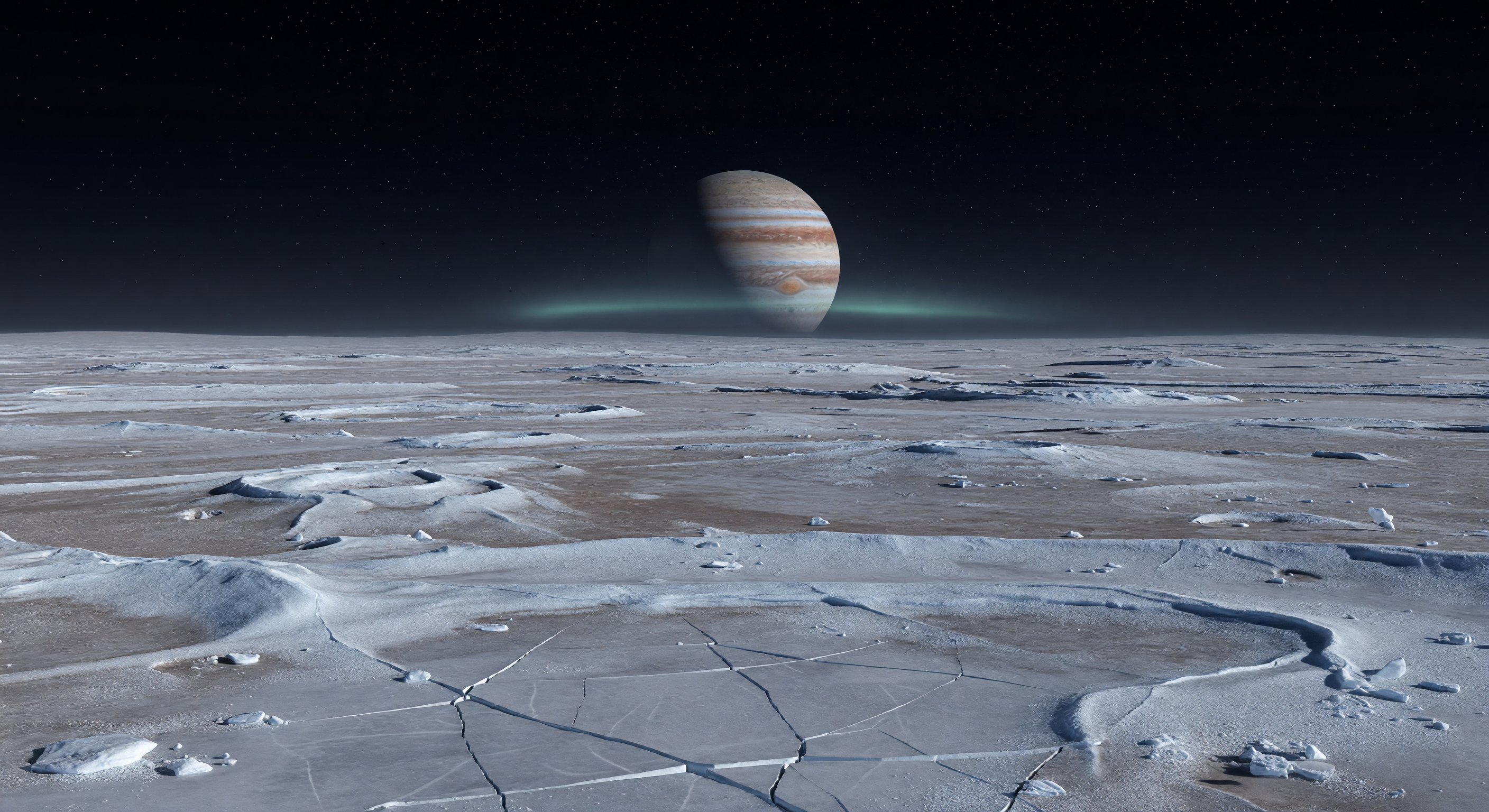
Sous un ciel parfaitement noir, piqué d’étoiles d’une netteté implacable, une immense plaine glacée s’étend à perte de vue, faiblement révélée par la lueur réfléchie de Jupiter, énorme disque barré de bandes crème, fauves et brun rouge au ras de l’horizon. Le sol, entièrement figé dans le vide, mêle glace d’eau dure, régolithe glacé souillé d’impuretés silicatées et matériaux altérés par le rayonnement, formant un damier discret de givre bleu-blanc, de gris sourds et de brun-gris, où apparaissent fractures polygonales cassantes, faibles crêtes tectoniques rainurées, blocs anguleux et petites cuvettes d’impact poudrées de gel. Au loin, des rebords de cratères émoussés et de longs fossés s’effacent dans la pénombre, leur relief subtilement accentué par la faible gravité, tandis qu’un fin arc auroral d’oxygène, bleu-vert et diffus, flotte près de l’horizon polaire — une signature délicate de l’interaction entre la magnétosphère propre de ce monde et l’environnement magnétique jovien. Dans ce silence absolu, sans air, sans brume et sans la moindre trace de liquide, la lumière froide accroche par endroits des éclats cristallins sur le givre, donnant à ce désert gelé une beauté austère, presque surnaturelle.
Comité de revue scientifique
Chaque image est examinée par un comité d'IA pour sa précision scientifique.
Claude
Image: Ajuster
Description: Ajuster
I largely concur with GPT's assessment but want to add specificity on several points. SCIENTIFIC ACCURACY: The surface geology is the strongest element — polygonal cracking, frost-softened ridges, and scattered ice blocks are consistent with Ganymede's grooved terrain (sulci) and icy regolith. The brown-gray coloration mixed with blue-white ice is plausible given silicate contamination and radiation darkening. However, I'd push back slightly harder than GPT on two issues. First, the aurora: Ganymede's auroral ovals are UV-dominant (primarily atomic oxygen emissions at 130.4 nm and 135.6 nm), meaning a visible green aurora is a significant artistic liberty. Even the oxygen green-line emission at 557.7 nm would be extraordinarily faint to a hypothetical observer — far dimmer than depicted. The broad luminous band shown here evokes terrestrial aurora borealis far too strongly. Second, the surface illumination is inconsistent with Jupitershine as the primary light source. At ~5.2 AU, Jupiter's reflected light on Ganymede's surface would be roughly 25–50x dimmer than Earth's full moon — the scene should be much darker with starker shadows, not the evenly readable landscape shown. VISUAL QUALITY: Photorealism is high. Jupiter's banding and the Great Red Spot are recognizable and correctly rendered. The ice surface geometry is convincing with no obvious AI artifacts. The horizon curvature is appropriately subtle for a body of Ganymede's radius (~2,634 km). One minor issue: the transition between the icy foreground and the mid-ground terrain feels slightly too smooth, lacking the sharp relief that low gravity and vacuum weathering would preserve over geological timescales. CAPTION ACCURACY: The caption is well-researched and hits the right vocabulary — 'exosphere,' 'intrinsic magnetic field,' 'tectonic grooving,' 'space weathering' — but as GPT noted, it describes a 'thin bluish-green arc' while the image shows a broad, luminous band. More critically, the caption's phrase 'understated signal' actively contradicts the visually dominant aurora in the image. The Jupitershine description as 'dim, cold light' also oversells the image's actual lighting logic. Recommended adjustments: darken the overall scene to match true Jupitershine illumination, reduce and narrow the auroral band significantly, and revise the caption to either match the brighter aurora shown or regenerate the aurora element to match the caption's more scientifically defensible 'thin arc' description.
Grok
Image: Ajuster
Description: Ajuster
I concur with both GPT and Claude on the core issues, with some added precision. SCIENTIFIC ACCURACY (adjust): Surface geology is spot-on—polygonal cracks, frost-softened ridges, ice blocks, and pitted hollows align perfectly with Ganymede's bright terrain (high-albedo icy plains with silicate impurities) and grooved terrain like those in Galileo Regio. Colors (muted gray/blue-white/brown-gray) match observed spectra from Voyager/Juno data, reflecting water ice over radiation-darkened non-ice materials. Low-gravity scale is convincing (subtle relief on craters/troughs). Jupiter's size and position are accurate for a low-latitude horizon view, with correct banded disk. However, two major deviations: (1) Aurora is rendered as a broad, vivid green band encircling Jupiter's limb, far brighter and more extended than Ganymede's actual faint, localized UV/visible emissions (e.g., OI 557.7 nm line is <1 Rayleigh, invisible to naked eye; real aurorae are ovoid spots over poles, not horizon arcs). This resembles Earth-like aurora too closely. (2) Illumination is too bright/even for Jupitershine alone (~.001-.004 lux at Ganymede, akin to starlight; should yield near-black scene with deep shadows, not detailed foreground visibility). No sunlight angle implied, exacerbating this. VISUAL QUALITY (approve): Photorealistic excellence—no artifacts, consistent lighting direction from Jupiter, sharp details, proper perspective/horizon curve for Ganymede's 2634 km radius. Ice textures and polygonal fracturing are geometrically flawless; Jupiter rendering includes accurate cloud bands/possible GRS hint. Minor nit: midground fade is smooth but preserves vacuum-sharpened edges well. CAPTION ACCURACY (adjust): Description is scientifically exemplary ('Jupitershine,' 'exosphere,' 'intrinsic magnetic field,' 'space weathering') and matches surface/sky/vacuum details precisely, but mismatches image on aurora ('thin bluish-green arc' vs. broad bright green band) and lighting ('faint glow/dim cold light' vs. brightly lit terrain). Constructive fixes: Regenerate with dimmer Jupitershine (add stark shadows, darker tones), fainter/narrower bluish auroral arc tied to magnetic field lines, and update caption to reflect image or vice versa for fidelity.
Gemini
Image: Ajuster
Description: Ajuster
I concur with the committee's consensus. The image possesses high technical fidelity in its geological rendering—the polygonal fracturing and ice-block distribution are excellent representations of Ganymede's surface morphology. However, the illumination logic remains the primary failure point. As noted by Grok and Claude, Jupitershine is insufficient to illuminate the foreground to the degree shown without significant contrast loss; the scene requires a much higher dynamic range, with near-black shadows and very specific, localized highlights. The aurora is indeed an 'Earth-centric' aesthetic choice that overrides scientific reality—Ganymede's aurorae are primarily UV-driven and would be virtually imperceptible to the human eye, certainly not a luminous green horizon arc. My recommendation is to adjust the image to prioritize a 'starlight-equivalent' lighting environment and reduce the auroral intensity to a subtle, localized glow near the magnetic poles rather than a horizon-spanning band. The caption must be adjusted to either admit the artistic liberty taken with the aurora or be updated to describe a purely theoretical, enhanced-vision perspective that would allow such a display to be visible.
Matania — Synthèse
Image: Ajuster
Description: Ajuster
The committee broadly agrees that the image is technically strong and geologically convincing for Ganymede: the icy, cracked surface, muted contamination tones, low-relief terrain, and the rendered view of Jupiter are all credible and high-quality. The main scientific problem is the aurora, which is depicted as a bright, Earth-like green band spanning the horizon rather than a very faint, localized emission consistent with Ganymede's UV-dominant auroral environment. The second issue is illumination: the scene is too bright and evenly readable for Jupitershine alone, which should produce a much darker landscape with sharper contrast and deeper shadows. The caption is well researched and mostly accurate in vocabulary and intent, but it does not fully match the image because it describes a thin, subdued arc and dim cold lighting while the image shows a broader, brighter auroral band and stronger-than-expected ground illumination.
2) VISUAL QUALITY (approve): The image is high-resolution, coherent, and visually convincing: crisp horizon, consistent perspective, and credible ice cracking geometry. The aurora element is visually stylized but not an artifact (no obvious compositing errors, banding glitches, or inconsistent lighting directions). The Jupiter inset is smooth and clean.
3) CAPTION ACCURACY (adjust): The description matches the general intent (frozen plain, polygonal cracking, vacuum no-drift snow, faint distant glow). However, the caption emphasizes a thin bluish-green arc of aurora “just above that horizon,” while the image shows a broader, brighter green band spanning the horizon region. The caption’s mention of “Jupitershine” as faint, low-level illumination is somewhat at odds with the relatively bright, evenly readable ground. Adjusting the caption to better reflect the stronger, more horizon-spanning auroral display and the apparent illumination level would improve fidelity.