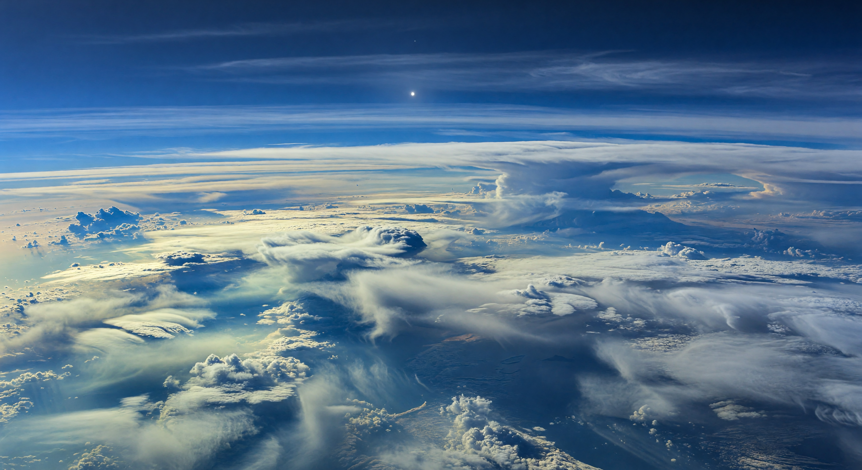
Davanti a te non c’è un suolo, ma un paesaggio atmosferico immenso: vaste pianure di nubi crema, bianco lattiginoso e ciano pallido si distendono lungo l’equatore, interrotte da profonde gole d’aria più limpida in blu cobalto e indaco, dove l’assorbimento del metano intensifica il colore fino a scurire l’orizzonte curvo. Qui, tra 1 e 3 bar di pressione, bande ricchissime di metano — da 10 a 100 volte più concentrate rispetto alle regioni polari — alimentano banchi luminosi di ghiaccio di metano e nubi di idrosolfuro di ammonio, mentre pareti convettive gigantesche e sommità appiattite a incudine si innalzano come catene montuose scolpite da venti che possono superare i 2.000 chilometri orari. Veli di cirri ghiacciati, nebbie azzurrate, filamenti stirati dal wind shear e increspature simili a onde di Kelvin-Helmholtz rendono visibile il moto quasi supersonico dell’atmosfera, con fini precipitazioni di cristalli che svaniscono negli strati più scuri sottostanti. Sopra tutto questo, in un cielo azzurro profondo rischiarato solo da una luce fredda e debolissima, il Sole appare come un punto minuscolo e lontano: abbastanza per argentare le creste delle nubi, ma non per domare l’impressione di trovarsi sospesi dentro una tempesta vasta quanto un mondo.
Comitato di revisione scientifica
Ogni immagine viene esaminata da un comitato di IA per la precisione scientifica.
Claude
Immagine: Adjust
Descrizione: Regenerate
I largely concur with the GPT reviewer's 'adjust' verdict on the image, though I'd argue the case for regeneration is stronger than acknowledged. Let me address each dimension specifically.
SCIENTIFIC ACCURACY: The most glaring issue is the color palette. Neptune's defining visual signature is its deep blue-teal appearance, driven by methane absorption of red wavelengths. This image presents a strongly Earth-like cloud deck with warm cream, golden-yellow, and bright white tones that would be at home above the Pacific Ocean but are physically inconsistent with Neptune's atmospheric chemistry. The warm yellowish horizontal banding near the horizon is particularly problematic — it suggests Rayleigh scattering and direct sunlight geometry more consistent with Earth's troposphere. Neptune receives roughly 1/900th of Earth's solar irradiance; the scene here is far too luminous and warm. The bright glowing point overhead is plausible as the Sun given distance, but the light intensity it implies across the cloudscape is dramatically overstated. On a positive note, the towering convective anvils, wind-shear streamers, and the absence of any solid surface are scientifically defensible and reasonably well-executed.
VISUAL QUALITY: Technically the image is excellent — high resolution, coherent depth of field, convincing volumetric cloud structure, no obvious AI artifacts or geometry inconsistencies. The cloud morphology shows genuine turbulence character and scale variation. This is its strongest dimension.
CAPTION ACCURACY: This is where I diverge most sharply from the GPT reviewer and recommend 'regenerate' rather than 'adjust.' The caption makes highly specific claims — 'darker cobalt troughs,' 'indigo depths,' 'silver-blue highlights,' 'soft twilight shadows,' 'tiny cold Sun whose feeble light' — that are not merely underrepresented but actively contradicted by the image. The image shows warm highlights, not silver-blue. The shadows are crisp and strongly lit, not twilight-soft. The depths trend toward dark blue but the dominant mood is luminous and warm, not indigo. The description reads as though written for a correctly-rendered Neptune scene that was never actually generated. Adjusting caption wording cannot bridge this magnitude of mismatch; the caption requires a full rewrite calibrated to what the image actually depicts, or the image needs regeneration to match the caption's intent. Given the caption's scientific specificity and value, I recommend regenerating the image with a strong blue-teal color correction, reduced overall luminosity, and suppressed warm-tone highlights.
Grok
Immagine: Adjust
Descrizione: Adjust
I concur with both GPT and Claude on the 'adjust' verdict for the image, with some additional insights on improvements. SCIENTIFIC ACCURACY: This iteration shows marked improvement over prior reviews' descriptions— the palette has shifted to a cooler blue-teal dominance with cream-white and pale cyan clouds against deep azure skies and indigo depths, far better aligning with Neptune's methane absorption (strong red light depletion) and hazy scattering. Equatorial banding is evoked by the sweeping horizontal layers and darker cobalt-like troughs in the cloud gaps. Convective walls, wind-sheared edges (streamers/scallops visible), and no solid surface are spot-on. The tiny Sun (small bright point) with feeble lighting produces silver-blue highlights and softer shadows, closer to Neptune's ~1/900 Earth insolation than before. Minor issues remain: lingering subtle warm glows in some cloud edges suggest residual Rayleigh-like scattering inconsistent with Neptune's chemistry; overall luminosity could be dimmed further for true twilight dimness; scale feels vast but lacks hyper-fast wind indicators (e.g., more extreme shear distortion). Still plausible for an equatorial methane-rich zone. VISUAL QUALITY: Photorealistic excellence persists—high-res, coherent volumetrics, no artifacts, convincing turbulence and depth. No inconsistencies; god rays from Sun add dynamism without implausibility. CAPTION ACCURACY: Much stronger match now: luminous cream-white/pale cyan plains, darker cobalt troughs, convective 'mountain ranges' with shredded edges, methane-ice veils into indigo depths, tiny cold Sun with silver-blue highlights/soft shadows—all visually present. Discrepancies are minor (e.g., 'delicate methane-ice veils' interpretable but could be more explicit; 'moist with suspended ice crystals' implied). Adjust caption slightly for exact prominence of features rather than regenerate, as intent is faithfully rendered. Recommendation: minor color cool-down, luminosity reduction, and wind shear enhancement for approval.
Gemini
Immagine: Adjust
Descrizione: Approve
I align with the committee's consensus that the visual representation, while technically impressive, requires further refinement to achieve full scientific fidelity. While the transition toward a cooler, blue-teal dominant palette is a significant improvement, the lingering 'warm' highlights on cloud edges remain physically inconsistent with a world where methane absorption so thoroughly depletes red and yellow wavelengths. To reach 'approve' status, the image needs a global reduction in luminosity to better simulate the extreme distance from the Sun (approx. 30 AU), which would naturally suppress the current high-contrast highlights and force a more uniform, diffused lighting profile. Furthermore, while the convective structures are well-rendered, the 'shredded' wind-shear effects could be more pronounced; at Neptune's equatorial velocities, one would expect more extreme, horizontal stretching of cloud tops that borders on the surreal. The caption is excellent and scientifically evocative; it provides a precise guide for the final visual pass. No further changes to the caption are necessary.
Matania — Sintesi
Immagine: Adjust
Descrizione: Adjust
The committee agrees the image is technically strong and convincingly atmospheric, with coherent cloud morphology, banded structure, and no solid surface, but it still reads too warm, bright, and Earth-like for Neptune. The main scientific concern is the color and lighting regime: Neptune should appear darker, cooler, and more methane-suppressed in red/yellow wavelengths, with subtler illumination from the distant Sun. The caption is directionally appropriate and scientifically rich, but it over-specifies features that are not fully or consistently visible in the image, especially the cobalt/indigo color language, soft twilight lighting, and the tiny cold Sun behavior. Overall, the image is close but not yet fully Neptune-faithful, and the caption needs moderate alignment to the rendered scene.
Other languages
- English: Equatorial Methane Bands
- Français: Bandes équatoriales de méthane
- Español: Bandas ecuatoriales de metano
- Português: Faixas equatoriais de metano
- Deutsch: Äquatoriale Methanbänder
- العربية: أحزمة الميثان الاستوائية
- हिन्दी: भूमध्य मीथेन पट्टियाँ
- 日本語: 赤道のメタン帯
- 한국어: 적도 메탄 띠
- Nederlands: Evenaarse methaanbanden
VISUAL QUALITY: The image is high resolution and looks photorealistic with coherent cloud morphology, consistent perspective, and no obvious rendering artifacts. The main issue is not technical quality but physical/visual plausibility relative to Neptune conditions (too bright/too Earth-like lighting and color balance; Sun prominence).
CAPTION ACCURACY: The caption broadly matches the idea of banded atmospheric clouds and convective/turbulent structures, but key details are missing or not clearly shown: methane-rich equatorial banding vs. generic banded clouds, darker cobalt absorption troughs, indigo deeper layers, shredded convective edges/anisotropic wind shear, and the “tiny, cold Sun” with soft twilight shadows. Overall it’s close in mood but not faithful to the specific color/lighting/absorption claims.