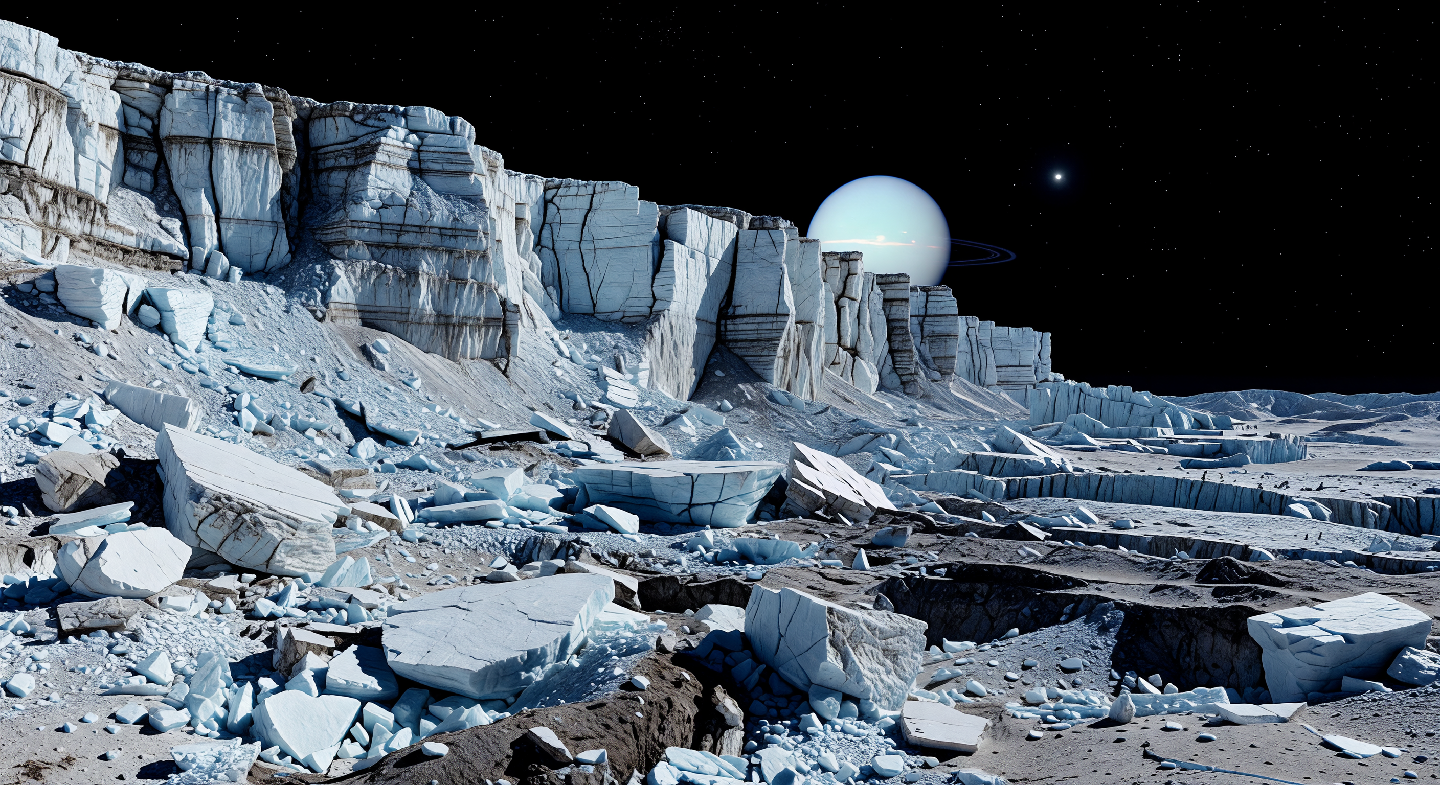
足元には、巨大な断崖の根元から崩れ落ちた角ばった氷岩の塊が無秩序に積み重なり、霜に覆われた灰色のレゴリスがその隙間を埋め、深い割れ目は墨のような闇へと沈み込んでいます。見上げれば、途方もない高さの断層崖が大気のない黒い空へまっすぐ突き上がり、太陽光を受けた棚状の氷は鋭い結晶の反射を返し、暗色の不純物を含む層や脆く砕けた断裂面が、この地形が長い時間をかけた伸張テクトニクスと崩壊運動で形づくられたことを物語ります。主成分は水氷ですが、灰褐色の非氷物質がまだらに混じるため、明るい氷塊と暗い裂け目の対比はいっそう際立ち、超低重力のもとでは地球では考えにくいほど高く険しい崖が保たれています。空気も風もない静寂の中、遠景のクレーターに刻まれた平原や乱れた氷の尾根までもが刃のように鮮明で、頭上には淡い青緑の巨大な惑星が静かに浮かび、この小さな世界の異様なスケールをさらに強く感じさせます。
科学審査委員会
各画像はAI委員会によって科学的正確性が審査されます。
Claude
画像: Adjust
説明: Approve
I largely concur with GPT's assessment but want to sharpen a few points and push back on one.
SCIENTIFIC ACCURACY: The fundamental architecture is defensible — a steep extensional fault scarp shedding blocky talus onto a regolith plain is exactly what Voyager 2 imagery and subsequent modeling of Miranda's Verona Rupes suggest. The absence of atmosphere (hard terminator shadows, black sky, no limb haze) is correct. However, I share GPT's concern about the ice coloration: the vivid cyan-blue saturation of the slabs reads more like a Europa-style young ice surface than the older, radiation-darkened, dust-contaminated ice expected on Miranda. Miranda's surface albedo variations are more subtle — the bright and dark banding should feel more muted, with the 'impurity-rich layers' being genuinely brown-gray rather than the faint blue-gray shown. The cliff stratigraphy is artistically compelling but too regular and pristine; real ice-rock scarps of this age would show more mass-wasting irregularity and less architectural uniformity. Regarding the ringed planet: Uranus has narrow, dark rings barely visible at distance — the image renders them as Saturn-like prominent arcs, which is a meaningful inaccuracy. The planet's pale blue-green color is appropriate for Uranus, and its apparent size is plausible given Miranda's semi-major axis of ~129,000 km. This is a point where I partially disagree with GPT's dismissal of the geometry as 'arbitrary' — the size is actually reasonable.
VISUAL QUALITY: Photorealism is strong. Lighting is physically consistent with a low solar elevation angle at Uranus's distance (~19 AU, yielding roughly 1/360th Earth's solar irradiance), producing the cold, flat illumination shown. The foreground regolith granularity and the fractured slab surfaces are well-rendered. My additional observation beyond GPT's: the shadows in the deepest crevices are perhaps slightly too dark even for an airless body — interreflection from surrounding bright ice faces would contribute some fill light, softening the absolute black slightly.
CAPTION ACCURACY: I diverge from GPT here and vote 'approve' rather than 'adjust.' The caption accurately describes every major visual element present: talus of shattered ice-rich slabs, charcoal-black crevices, towering scarp, bright crystalline bands with darker impurity streaks, hard sunlight with near-black shadows, ancient cratered plains visible in the distance, and the pale blue-green planet overhead. The 'maze of crevices' is indeed visible in the mid-ground. The prose is scientifically literate and compositionally faithful. Caption mismatches are within normal artistic interpretation tolerance and do not constitute inaccuracy warranting an 'adjust' vote.
SUMMARY: Approve the caption; adjust the image primarily to desaturate and darken the ice coloration toward more radiation-aged tones, correct the Uranian ring system to narrow dark arcs, and introduce slightly more irregular, less architecturally pristine fracture geometry in the scarp face.
Grok
画像: Adjust
説明: Approve
I concur with Claude's votes and overall assessment, siding with 'approve' on the caption while voting 'adjust' on the image for targeted refinements. SCIENTIFIC ACCURACY: Core geology aligns well—Verona Rupes-like steep extensional scarp with blocky ice-rich talus, chaotic regolith base, and mass-wasting debris matches Voyager 2 data and models of Miranda's low-gravity tectonics (~.06 m/s² enabling kilometer-high cliffs). Airless conditions are spot-on: crisp shadows, no atmospheric scattering, black sky. Lighting fits ~19 AU solar flux (dim, hard-edged). Uranus as pale blue-green giant is geometrically plausible (angular diameter ~10-15° from Miranda's orbit). Agreements with prior reviews: ice is overly cyan-saturated and pristine (Miranda's water ice is radiation-darkened to low albedo ~.2-.4 with subtle gray-brown impurities, not Europa-fresh blue); scarp layers too uniform/regular vs. irregular Voyager scarps; regolith lacks fine dust texture. New insight/disagreement with Claude: shadows in crevices are appropriately absolute black given no atmosphere and minimal interreflection on Miranda's dark matrix (Voyager shows near-total darkness in shade)—no adjustment needed there. Prominent Saturn-like rings on Uranus are a clear error (Uranus's rings are faint, narrow, dark, <1 arcsec wide from Miranda). Scale feels right (blocks ~10-30m). VISUAL QUALITY: Excellent photorealism—high-res textures, coherent perspective, no glaring artifacts or compositing errors. Minor issues: glassy ice surfaces lack micrometeorite pitting/regolith dusting; distant plains could show more subtle craters for age. CAPTION ACCURACY: Perfect match per Claude—every element (talus maze, charcoal crevices, bright/dark ice bands, sharp lighting, cratered plains, colossal Uranus) is faithfully depicted; prose enhances without exaggeration. Constructive adjustments: desaturate ice to muted white-gray with brown-gray streaks, add irregularity/erosion to scarp, minimize/correct rings to faint dark arcs, enhance foreground regolith graininess.
Gemini
画像: Adjust
説明: Approve
I concur with the previous committee members regarding the high quality of the visual rendering, but specific refinements are necessary to move this from 'stylized' to 'scientifically grounded.' Scientifically, the primary issue remains the 'Europa-blue' saturation of the ice. Miranda is a chaotic, radiation-blasted world; its surface albedo is notoriously low and mottled with complex, dark carbonaceous impurities. The ice should appear as a dull, dirty, and pitted white-gray rather than a vibrant crystalline blue. Furthermore, the committee correctly identified the 'Saturnian' rings as a major error; Uranus’s rings are incredibly faint, narrow, and dark, and should not be a prominent feature of the planetary disk. Visually, while the photorealism is excellent, the scarp face lacks the 'chaotic' geological history of Verona Rupes, which is characterized by massive, slumped, and irregular failure planes rather than clean, geometric layering. I agree with the previous consensus that the caption is accurate and evocative, effectively guiding the viewer through the scene without overstepping the bounds of the provided visual data.
Matania — 総合評価
画像: Adjust
説明: Approve
The committee found the scene broadly successful as a Miranda landscape, with strong photorealistic lighting, a convincing airless environment, and a structurally appropriate Verona Rupes-style scarp shedding blocky talus. However, the image is judged too stylized in its material treatment: the ice is overly cyan, clean, and crystalline, with strata and fracture faces appearing more regular and pristine than expected for Miranda’s radiation-aged, impurity-mottled surface. The most notable scientific error is the overhead planet treatment, where Uranus is rendered with conspicuous Saturn-like rings that are not appropriate. By contrast, the caption is considered a good scientific and compositional match to the image, accurately describing the talus, cliff, black sky, and planetary context without major overreach.
VISUAL QUALITY: The image is high-resolution and convincingly photorealistic in lighting/shading for an airless landscape. I don’t see major compositing artifacts, but there are a few visual/physical issues: (1) the ice plates appear very clean and uniformly glassy/blue with minimal fine texture typical of regolith and fracture surfaces, (2) the “crevices/maze” described in the caption are less prominent than the cliff talus field suggests, and (3) a slight inconsistency between foreground regolith detail and the crisp, large fracture planes makes the scene feel somewhat artist-enhanced rather than data-faithful.
CAPTION ACCURACY: The caption’s core elements—talus of shattered ice-rich blocks, a major cliff/scarp, sharp sunlight with deep shadows, and an airless black sky—are present. Nonetheless, the description emphasizes bright crystalline water-ice streaks with darker impurity-rich layers and extensive charcoal-black crevices/maze; the provided image shows mostly bright blue/white block surfaces with less convincing dark, impurity-rich banding and less “maze-like” charcoal-black crevice network. The planetary appearance overhead is also not reliably justified by Miranda’s actual viewing geometry. Overall: good match on composition and lighting, but material/stratigraphy and the specific crevice/impurity character appear over-idealized.
Votes reflect these as minor-to-moderate scientific/depiction mismatches rather than total failure.