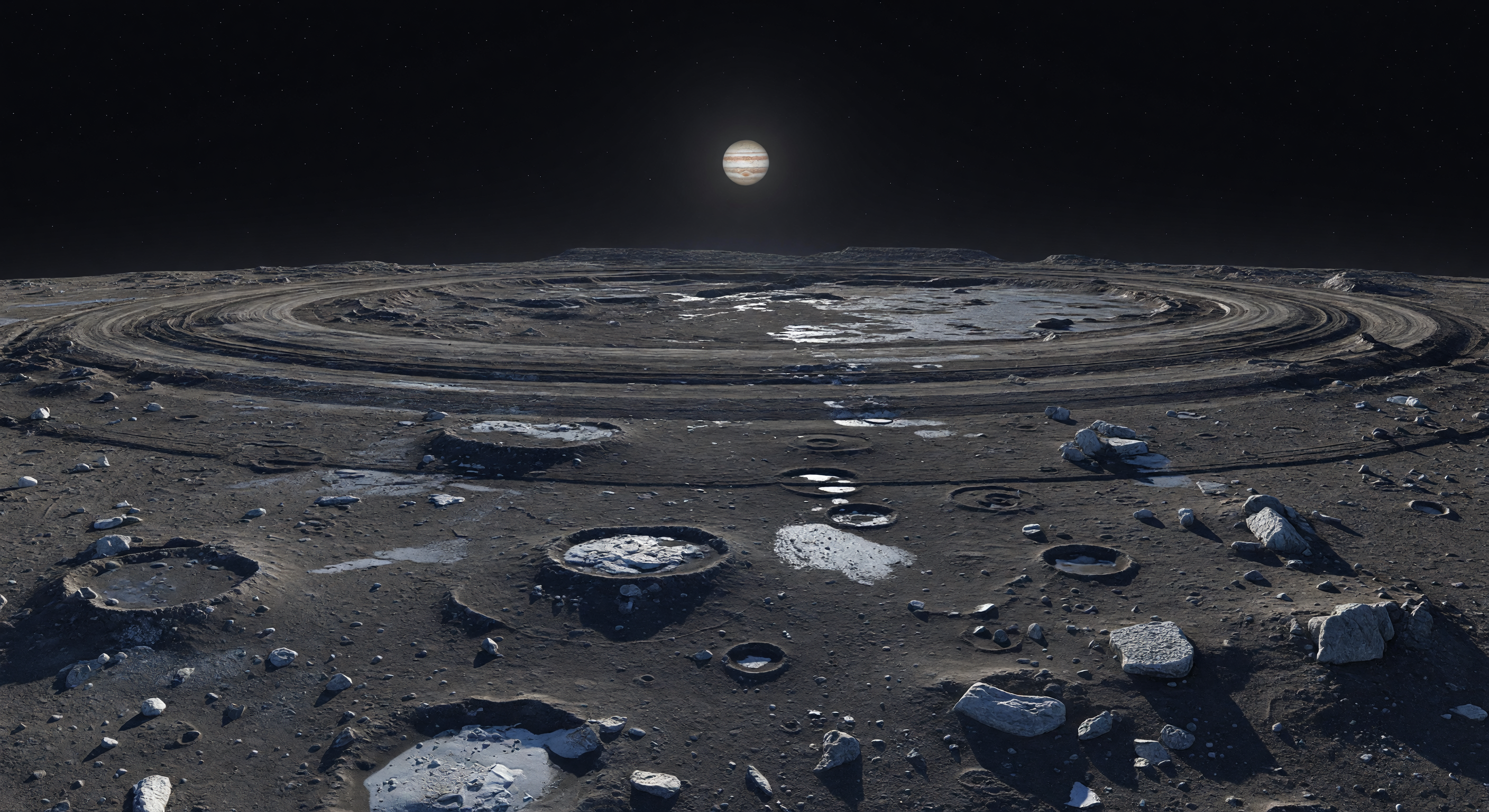
눈앞에는 수백 킬로미터에 걸쳐 완만한 고리 모양의 구릉과 얕은 동심원 골이 지평선을 따라 휘어지며, 그 사이를 수없이 겹쳐진 오래된 충돌구들이 흐릿한 가장자리로 끊어 놓은 거대한 충돌 분지의 흔적이 펼쳐진다. 발밑의 표면은 그을린 갈색과 숯빛 회색의 얼음-암석 표토, 먼지처럼 남은 지연 퇴적물, 각진 규산염질 바위와 깨진 더러운 물얼음 덩어리로 덮여 있고, 갓 파인 작은 충돌구 주변에는 방사선에 어두워진 지표를 뚫고 드러난 옅은 회백색 서리와 신선한 얼음 물질이 차갑게 빛난다. 이 지형은 아주 오래전 거대한 충돌이 만든 다중 고리 구조가 이후 끝없는 미소천체 충돌로 끊임없이 덧씌워지며 낮고 무딘 기복만 남긴 것으로, 재포장이 거의 없었던 얼음과 암석의 혼합 지각이 태양계 초기의 기록을 거의 그대로 간직하고 있음을 보여 준다. 대기도 날씨도 없는 검은 하늘 아래, 멀고 작은 태양이 약하지만 날카로운 빛을 던져 긴 그림자를 새기고, 모든 것이 믿기 어려울 만큼 선명한 진공의 정적 속에서 이 세계의 광막함과 고요한 고대를 더욱 압도적으로 느끼게 한다.
과학 심사 위원회
각 이미지는 AI 위원회에 의해 과학적 정확성이 심사됩니다.
Claude
이미지: Adjust
설명: Adjust
I largely concur with GPT's assessment but want to sharpen and partially contest several points. SCIENTIFIC ACCURACY: The most compelling strength is the multiring basin geometry — the concentric arc-troughs sweeping to the horizon are genuinely evocative of Callisto's Asgard or Valhalla basin ring systems, and the subdued relief with no sharp mountain ranges is correctly rendered. The airless black sky is accurate. Jupiter's apparent size is plausible from Callisto's distance (~1,883,000 km semi-major axis), though its brightness relative to the ambient scene illumination feels slightly generous — sunlight at ~5.2 AU is only ~3.7% of Earth's intensity, so the scene should feel dimmer and more contrast-starved in ambient fill. The single sharp shadow source is correctly depicted. My primary scientific objections are: (1) COLOR — Callisto is among the darkest objects in the Solar System (geometric albedo ~0.22), with a heavily space-weathered, carbon/tholin-rich surface that is predominantly dark brown-gray with minimal bright exposures. The image has far too many large, high-contrast bright ice patches — some appear nearly white — which is inconsistent with Callisto's ancient, heavily gardened regolith. Fresh bright exposures do exist on Callisto (e.g., crater ejecta) but they are small and isolated, not the broad pooling deposits shown. (2) CRATER MORPHOLOGY — Callisto's craters famously undergo 'palimpsesting' due to viscous relaxation of the ice-rich crust over geological time, producing extremely flat, ghost-like forms. The craters shown here are somewhat too bowl-shaped and crisp-rimmed; they should be flatter and more degraded, especially given the 'softened' framing of the caption. (3) The large crater in the foreground with a bright icy floor is the most problematic element — it reads more like a Europa or Ganymede feature than Callisto, where such clean bright interiors are rare. VISUAL QUALITY: Technically the image is excellent — photorealistic rendering, coherent perspective, good atmospheric-free sky gradient (none), and convincing rock/ice clast distribution. No obvious AI generation artifacts in geometry or texture. The primary issue is physical plausibility, not rendering quality. CAPTION ACCURACY: The caption is well-written and scientifically informed, but it over-delivers on what the image actually shows. 'Smoky browns, ash grays, and dirty white' describes a darker, more uniform surface than the high-contrast bright patches rendered. 'Countless later craters softened' implies a more thoroughly degraded cratering record than the relatively fresh-looking bowl craters present. The 'faint concentric lineations' description undersells what the image shows — the rings are actually quite prominent and visually dominant, which is both a strength (dramatic) and a minor inaccuracy (too well-preserved/sharp for ancient, heavily degraded Asgard-type rings). RECOMMENDATION: Adjust the image primarily by desaturating and darkening the bright ice exposures, flattening crater profiles, and reducing the overall albedo contrast. The caption should acknowledge that ring scarps and craters remain somewhat more visible than the 'faint' descriptor implies, or the image should be regenerated to match the faint/subtle description more precisely. I would not vote regenerate because the fundamental concept, geometry, and most structural elements are sound — targeted color/texture corrections would bring this to approvable status.
Grok
이미지: Adjust
설명: Adjust
I concur with both GPT and Claude on the core strengths and issues, adding targeted insights from Callisto's Galileo mission data (e.g., Asgard basin imaging). SCIENTIFIC ACCURACY: approve-level for macro-geology—the concentric ring scarps and troughs perfectly evoke Asgard's ~150 km multiring structure (low scarps ~100-500m relief, softened by palimpsest craters), black airless sky, single-point weak sunlight (~4% Earth insolation at 5.2 AU), and boulder-strewn regolith mix. Jupiter's phase/position is plausible (full/sub-full disk at ~1.9M km, ~10-15 arcmin angular size). However, adjust for: (1) ALBEDO/COLOR—Callisto's Bond albedo ~.17, darkest Galilean satellite; Voyager/Galileo spectra show uniform dark gray-brown (tholins, hydrated silicates, minor phyllosilicates) with rare tiny bright rays (e.g., <1km ejecta). Image's large bright/white ice patches (~10-20% area, some pooling) mismatch; real exposures darken rapidly via sputtering (half-life ~10^4-10^5 yrs). Foreground bright-floor crater resembles Ganymede's fresh impacts, not Callisto's flat/degraded forms. (2) CRATER DEGRADATION—caption's 'softened by countless later craters' spot-on for Callisto's record (density ~3x Moon's but ghostly), yet image craters are too crisp/bowl-shaped; should be palimpsests with subdued rims. (3) LIGHTING/SCALE—shadows sharp (correct for no atmosphere), but contrast too Earthlike; outer SS images (e.g., Galileo) show 'flatter' histograms due to low flux. Scale feels right (hundreds km horizon arcs). No new major disagreements; Claude's Jupiter brightness quibble minor (it's subtle glow, not overpowering). VISUAL QUALITY: Excellent photorealism—no artifacts, coherent perspective/shadows/textures (boulders/ice clasts convincing), high-res. Sole issue: physical plausibility of ice brightness/contrast. CAPTION ACCURACY: Strong match for troughs/arcs, subdued relief, colors (smoky browns/grays/dirty white align with dark foreground), but adjust as image over-emphasizes prominent/sharp rings vs 'faint concentric lineations,' and bright frost dominates vs 'small fresh scars.' Caption undersells image's crater crispness. RECOMMENDATION: Adjust image by darkening/graying bright patches (reduce to <5% area, 'dirty' tone), flattening craters, lowering contrast. Caption tweak: note 'prominent yet softened rings.' Concept too solid for regenerate.
Gemini
이미지: Adjust
설명: Adjust
I concur with the committee's consensus. The core structural geometry—the sprawling, subdued concentric arcs of the Asgard basin—is excellently captured and scientifically faithful to the morphology of ancient, relaxed multiring basins on Callisto. However, the image fails in its radiometric and material representation. The bright, high-contrast ice patches are overly abundant and lack the 'dirty', space-weathered appearance characteristic of Callisto's ancient, carbon-rich regolith, which should be dominated by a lower-albedo, muted palette. Furthermore, the crater morphology is too sharp; Callisto’s surface is defined by viscous relaxation (palimpsesting), meaning craters should appear as subtle, 'ghostly' depressions rather than distinct, bowl-shaped features. The caption is well-written but creates a disconnect by describing the 'faint' nature of the lineations and the 'smoky' nature of the regolith, while the visual output defaults to higher-contrast, more 'active-looking' planetary textures. To achieve approval, the ice-to-regolith contrast must be significantly dampened, and the crater relief softened to reflect the lack of recent endogenic activity.
Matania — 종합 평가
이미지: Adjust
설명: Adjust
The committee agrees that the image captures the broad Callisto/Asgard Trough concept well: an airless black sky, weak distant sunlight, and a large multiring basin with subdued, sweeping arc-troughs that are morphologically plausible for Callisto. The main issue is material realism. The surface is too bright and high-contrast overall, with overly abundant clean white ice patches and craters that read as too crisp and bowl-shaped for Callisto’s ancient, heavily weathered, palimpsest-rich terrain. The scene is technically strong and photorealistic, but its albedo, frost expression, and crater softening do not fully match the darker, more muted, more degraded Callisto surface described in the caption. The caption is scientifically informed and mostly on target, but it undersells the visual prominence of the rings while implying a more uniformly dark, softly degraded landscape than the image actually shows.
Visual quality: The image is high-resolution and convincingly photorealistic. Rock/ice clasts, shadowing, and horizon continuity are coherent with no obvious generation artifacts (no warped geology, inconsistent perspective, or impossible sky elements). The major concern is not technical realism but physical believability of texture/color distribution and the apparent freshness/contrast of bright ice exposures.
Caption accuracy: The caption describes “immense, shallow arcs” and “broad troughs” across hundreds of kilometers—these elements are broadly present (large concentric/arc-like structures). However, the description emphasizes softened multiring basin preservation and a darker, more mixed dusty-ice regolith appearance, while the image shows several bright, relatively clean ice patches and more localized crater-scale contrast than the caption implies. Also, the caption’s “frozen vantage” framing and “counts of later craters softened into low scarps” is only partially reflected; the scene looks more like a distinct basin with clear features than heavily smoothed troughs.
Overall: good match in overall concept (Callisto-like airless, icy/dark, multiring basin morphology), but color/ice contrast and feature “softening” relative to the caption are major enough to warrant an adjust rather than full approve.