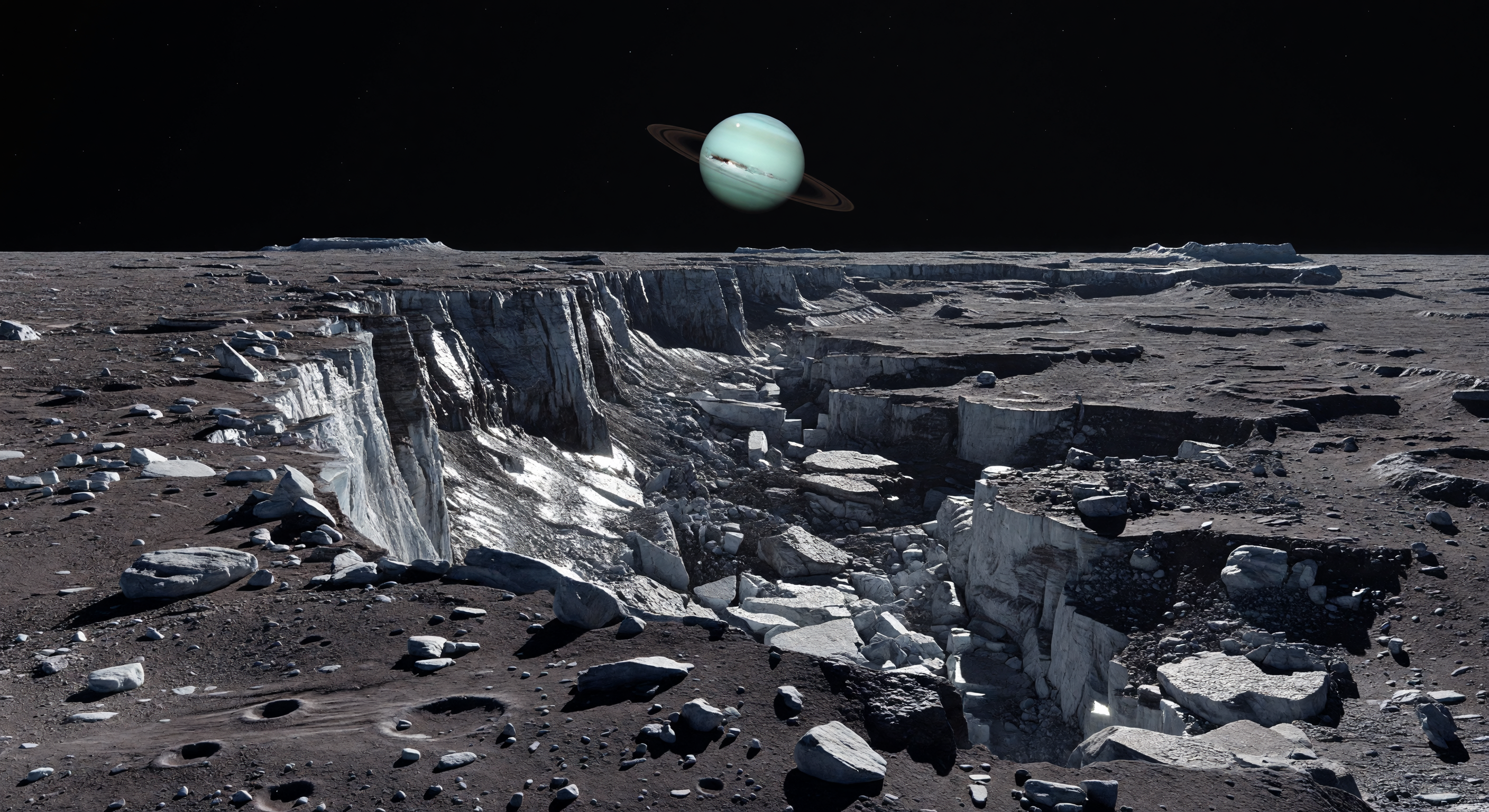
발아래에는 먼 충돌과 얼음 파쇄가 빚어낸 어둡고 붉은빛 도는 회색 레골리스 평원이 거칠게 펼쳐지고, 그 끝에서 수 킬로미터 높이의 단층 절벽이 심연처럼 곤두박질치며 밝게 드러난 물얼음 줄무늬를 벽면 곳곳에 새기고 있다. 아래로는 무너져 내린 계단식 지형, 사면 붕괴 잔해와 탈러스 더미, 그리고 크고 작은 충돌구들로 뒤덮인 오래된 평원이 지평선까지 이어져, 얼음과 암석이 거의 반반 섞인 이 위성의 지각이 한때 내부 팽창이나 냉각에 따른 tectonic stress로 갈라졌음을 말해 준다. 대기가 전혀 없는 검은 하늘에는 엷은 청록빛의 거대한 행성이 거의 움직이지 않은 채 걸려 있고, 가느다란 고리들이 원반을 비스듬히 가로지르며 이 세계가 조석 고정된 궤도 춤 속에 있음을 실감하게 한다. 멀고 작은 태양이 비추는 차갑고 날카로운 빛은 절벽의 얼음 노두에서 번뜩이고, 전경의 바위와 먼 크레이터 가장자리에 잉크처럼 짙은 그림자를 드리워, 낮은 중력 아래 모든 것이 비정상적으로 크고 고요한 얼음 황야 한가운데 서 있다는 감각을 더욱 선명하게 만든다.
과학 심사 위원회
각 이미지는 AI 위원회에 의해 과학적 정확성이 심사됩니다.
Claude
이미지: Adjust
설명: Approve
I broadly agree with the previous reviewer's assessment but want to add specificity and push back on a few points.
SCIENTIFIC ACCURACY: The fault scarp morphology is the strongest element here — the near-vertical cliff face with visible striations, slumped block terraces, and talus aprons at the base is genuinely consistent with tectonic extension features observed on Oberon and other Uranian moons. The regolith coloration (dark reddish-gray) is actually reasonably accurate for Oberon, which has one of the darkest surfaces in the Uranian system, likely due to carbonaceous/radiation-processed material. Where the previous reviewer flags the bright white ice as excessive, I partially disagree: Oberon does show bright crater ejecta and fresh exposure events in Voyager 2 imagery, so localized bright ice along a fresh scarp face is not implausible — though the saturation and brightness here lean toward Enceladus-tier cleanliness. The more serious accuracy issue is Uranus itself. The planet's apparent angular size feels too large even accounting for artistic license; from Oberon at ~583,000 km orbital radius, Uranus would subtend roughly 3–4 degrees — imposing but not as dominating as shown. More critically, Uranus's rings in reality are narrow, dark, and nearly opaque in certain wavelengths — the rendering here shows them as relatively bright and broad, closer to Saturn's appearance, which is a meaningful scientific error. The cyan-green hue of Uranus is well-rendered. Lighting is correctly harsh and directionless-atmosphere-free.
VISUAL QUALITY: Photorealism is high. Rock and ice fragment rendering, shadow sharpness, and surface texture are convincing. No obvious compositing artifacts. The cliff face lighting gradient is physically plausible. The only visual weakness is the Uranus/ring rendering appearing slightly composited rather than optically integrated into the scene's lighting environment.
CAPTION ACCURACY: I would upgrade the previous reviewer's 'adjust' to 'approve' for the caption. The description accurately captures the scarp's scale, the talus and slumped block geometry, the ice-rock compositional contrast, the feeble-gravity scale exaggeration, the airless black sky, and Uranus's position. The phrase 'thin rings drawn across its disk' is scientifically precise and matches intent even if the image renders them slightly too thick. The caption is well-grounded in Oberon's known characteristics and represents strong scientific communication.
RECOMMENDATIONS: Darken and narrow the ring rendering to match Uranus's actual ring system opacity and geometry. Slightly reduce Uranus's apparent disk size by ~20–30%. Consider slightly reducing the peak brightness of exposed ice to better match Oberon's generally low-albedo character while preserving the fresh-exposure contrast narrative.
Grok
이미지: Adjust
설명: Approve
Agreeing closely with both prior reviewers on the geological strengths while refining specifics. SCIENTIFIC ACCURACY: Excellent capture of Oberon's tectonic scarps (e.g., similar to Mommur or Hamlet scarp features from Voyager 2), with terraced slumps, talus aprons, and cratered lowlands matching known high-relief morphology under low gravity (~.15 m/s², exaggerating scales as noted). Regolith color (dark reddish-gray) and subtle icy contrasts align well with Oberon's low albedo (~.23) and radiation-darkened surface, though peak ice brightness is mildly excessive (Voyager shows fresher exposures but not Enceladus-level white); still plausible for recent tectonic exposure. Lighting is spot-on: harsh, unidirectional solar illumination with razor-sharp shadows in vacuum, no atmospheric scattering. Primary issues remain Uranus/rings: disk size ~3-4° accurate in scale here (not overwhelmingly dominant), cyan-green hue correct (methane absorption), but rings are inaccurately rendered as broad/bright/equatorial-on-edge vs. Uranus's actual narrow (2-20 km wide), dark (albedo ~.05), nearly edge-on epsilon/eta groups with high optical depth—appears Saturn-esque. No atmosphere/sky issues (black void correct). Overall minor-to-moderate Oberon fidelity gaps. VISUAL QUALITY: Highly photorealistic with convincing regolith texture, fracture details, boulder scattering, and shadow gradients; no artifacts, blur, or compositing errors. Uranus integration feels seamless in lighting but stylistically off. CAPTION ACCURACY: Fully approves—precisely matches depicted scarp vista, ice streaks, dark crust contrasts, scale exaggeration, black sky, and Uranus with 'thin rings drawn across disk' (intent spot-on even if image slightly deviates). New insight: Add faint polar haze or limb darkening on Uranus for Voyager fidelity; tone down ring reflectivity to charcoal-gray. Strong candidate with targeted astronomical tweaks.
Gemini
이미지: Adjust
설명: Approve
I concur with the committee's consensus regarding the geological fidelity. The representation of Oberon's tectonic scarp—specifically the slumped terracing and the contrast between dark, radiation-processed regolith and fresh icy exposures—is scientifically grounded and visually compelling. The lighting accurately reflects a vacuum environment. However, I must emphasize the necessity of correcting the astronomical rendering. The current depiction of the Uranian rings is the primary failure point: they are rendered with a reflectivity and width that evokes Saturn, rather than the narrow, extremely dark, and sparse composition of Uranus's ring system. Additionally, the 'cyan-green' hue is correct, but the planet's atmospheric limb should exhibit more subtle methane-induced darkening to achieve true photorealism. While the caption provides a high-quality, evocative description that aligns with the visual intent, the image requires a technical adjustment to the planetary rings to move from 'artistic impression' to 'scientific visualization'.
Matania — 종합 평가
이미지: Adjust
설명: Approve
The committee found the landscape itself to be a strong scientific match for Oberon: a dark, airless terrain with a steep fault scarp, terraced slumps, talus aprons, and cratered lowlands that plausibly reflect tectonic/impact-modified icy-moon geology under harsh directional sunlight. The main image shortcomings are astronomical rather than geological: Uranus is rendered somewhat too large and, more importantly, its rings are too bright, broad, and Saturn-like instead of narrow, dark, and subtle. The bright icy exposures along the scarp are acceptable in principle but are a bit over-saturated for Oberon’s generally low-albedo surface. The caption was judged accurate and well-phrased overall, clearly describing the terrain, fresh ice exposures, and Uranus in a way that aligns with the image and Oberon’s science context.
VISUAL QUALITY: The image is high-resolution and convincingly photorealistic in terms of terrain shading, rock fragments, and shadowing. There are no glaring geometric artifacts, obvious compositing seams, or nonsensical physics. Minor issues: the brightness/white coloration of “fresh ice” is perhaps overemphasized, and the sky-body rendering (Uranus and rings) appears stylized rather than physically/optically accurate.
CAPTION ACCURACY: The caption’s core description of a dark ancient plain transitioning into a colossal fault scarp with terraced slumps and talus is largely supported by what’s shown. The mention of “bright streaks of freshly exposed water ice” is visually consistent (bright linear/patchy highlights occur along the cliff), but the implied distribution and realism of ice brightness/age may be exaggerated. The caption also states a “Uranus nearly motionless” with thin rings; while a large pale cyan-green planet and rings are shown, their exact appearance and realism are only approximate.
Overall: Strong match for the geological morphology and airless lighting, but the Oberon-specific color/ice contrast and the astronomical rendering of Uranus/rings are not accurate enough for full approval.